Wallpaper trends worth following this year
Five directions we keep seeing in real rooms rather than mood boards, and a short note on which ones are worth committing a wall to.
Trends · The Wallbu team · Sep 2, 2026 · 6 min read
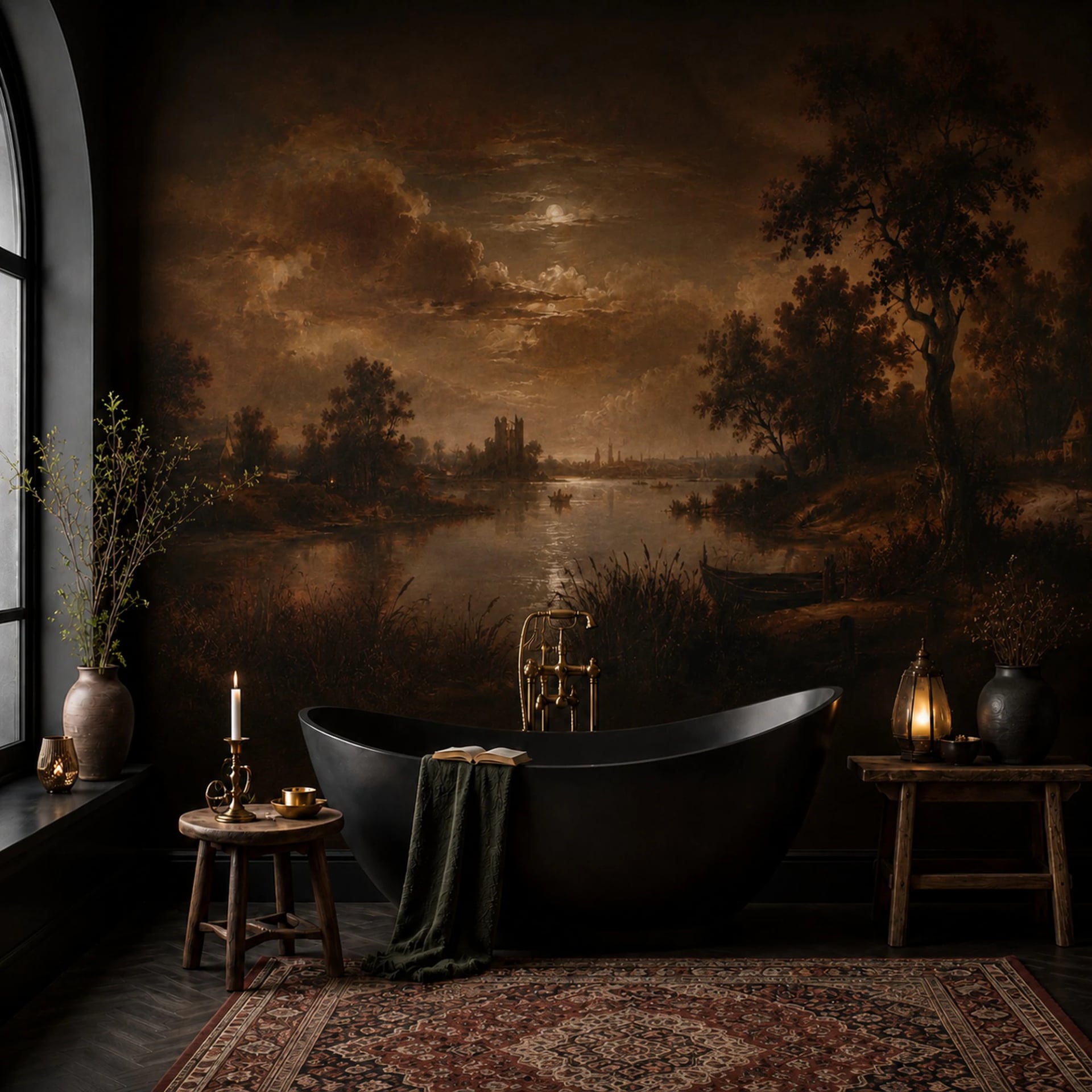
Trend pieces usually describe what looks good in a photograph. A wall is not a photograph. It is in front of you every day for years, which is a much harder test, and it is the test we use when deciding what to add to the catalog.
Here are five directions we keep seeing in the orders that actually get placed, with an honest note on how each one wears.
1. Texture instead of pattern
The clearest shift of the past two years. Plaster, limewash, raw linen, unglazed clay, hand-troweled concrete. Designs that have almost no motif and a lot of surface.
They work because they solve the problem that keeps people on paint: pattern fatigue. A textured wall gives a room depth and warmth without ever asking for attention, and it does not stop being tolerable in year three.
Wears well. This is the safest thing on the list. If you want one wall to be interesting and you are nervous about committing, this is where to start. Our Textured paper and Premium Textile double the effect, because the printed texture sits on real texture.
2. Very large scale, very few elements
A single branch across twelve feet. One arch. Three hills and a horizon. The move is toward fewer, larger shapes with room to breathe between them.
This is the direction made-to-measure printing is genuinely better at than rolls. A repeat has to be small enough to tile. A mural printed to your wall can have one element, placed deliberately.
Wears well, with a condition. The condition is furniture. A design with a lot of open space needs that space to stay open. If the wall ends up behind a bookcase, a big single motif is the worst possible choice.
3. Warm, dusty, slightly dirty color
Clean brights have given way to color with grey in it. Ochre rather than yellow. Terracotta and clay rather than orange. Sage and olive rather than green. Plaster pink. Everything looks as though it has been in sunlight for a decade.
Part of this is a reaction to a decade of cool grey interiors, and part of it is that these colors are extremely forgiving. They flatter warm artificial light, which is the light most rooms are actually seen in.
Wears well. Muted color is easier to live with and much easier to furnish around than saturated color.
4. Painterly and hand-made marks
Visible brushwork, watercolor bleed, block-print irregularity, a line that clearly came from a hand rather than a vector tool. After years of flat, perfectly repeating digital pattern, a wall that shows evidence of a person making it reads as warm.
Wears well, with a caveat. Look closely at how the repeat is handled before you commit. A painterly design that still tiles on an obvious grid is the worst of both worlds, and you will see the grid forever once you have noticed it. A scenic mural sidesteps the problem entirely, because there is no repeat.
5. The small room getting the loud wall
The rooms people are papering have changed. Less living room, more powder room, entry, laundry, the inside of a closet, the back of a bookcase, a stair landing.
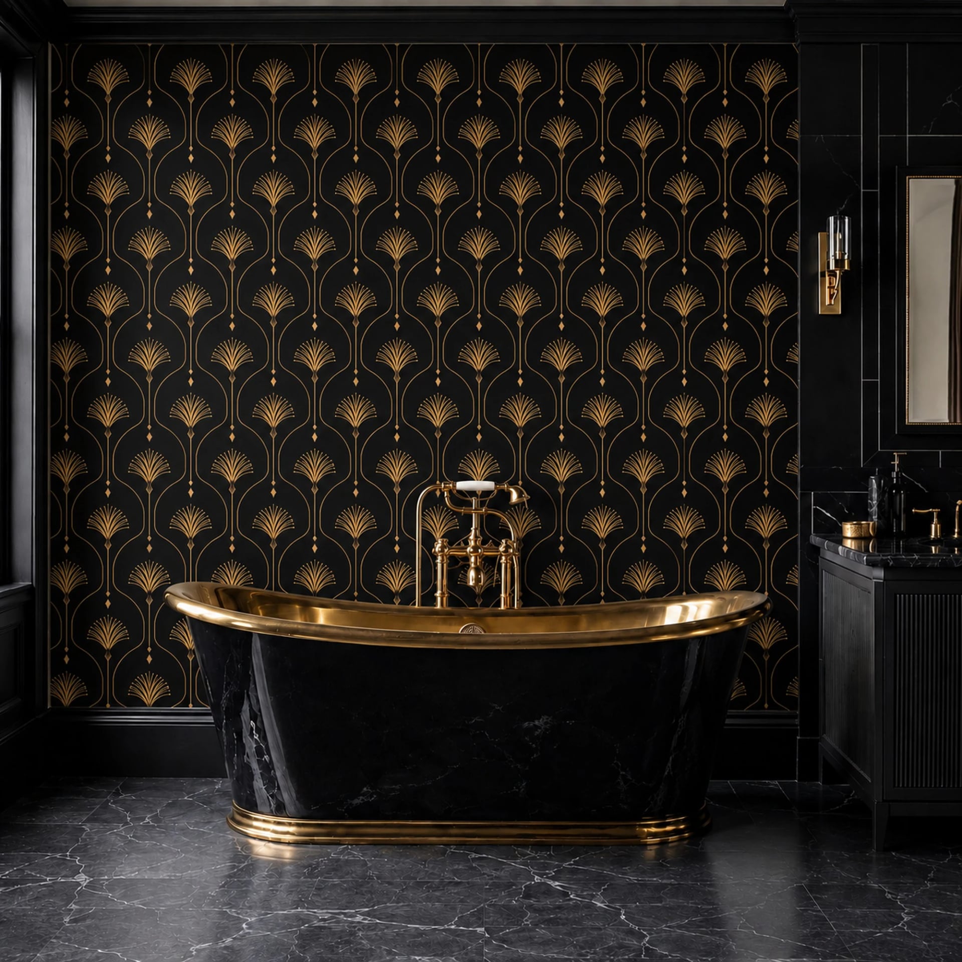
The logic is sound. A powder room is thirty square feet. You can be genuinely bold there for the price of a nice lamp, nobody spends an hour in it, and it is the room guests are most likely to see alone and remember.
Wears well. This is the best value idea in interiors right now, and it is the one we would recommend to anyone who has been thinking about wallpaper for two years and not ordered.
What we would skip
Anything that depends on a specific piece of furniture. Designs that only work with a particular bed, sofa or light fitting have the lifespan of that object.
Novelty repeats. A pattern that is funny the first time is not funny the four-hundredth time, and a wall is a four-hundredth-time medium.
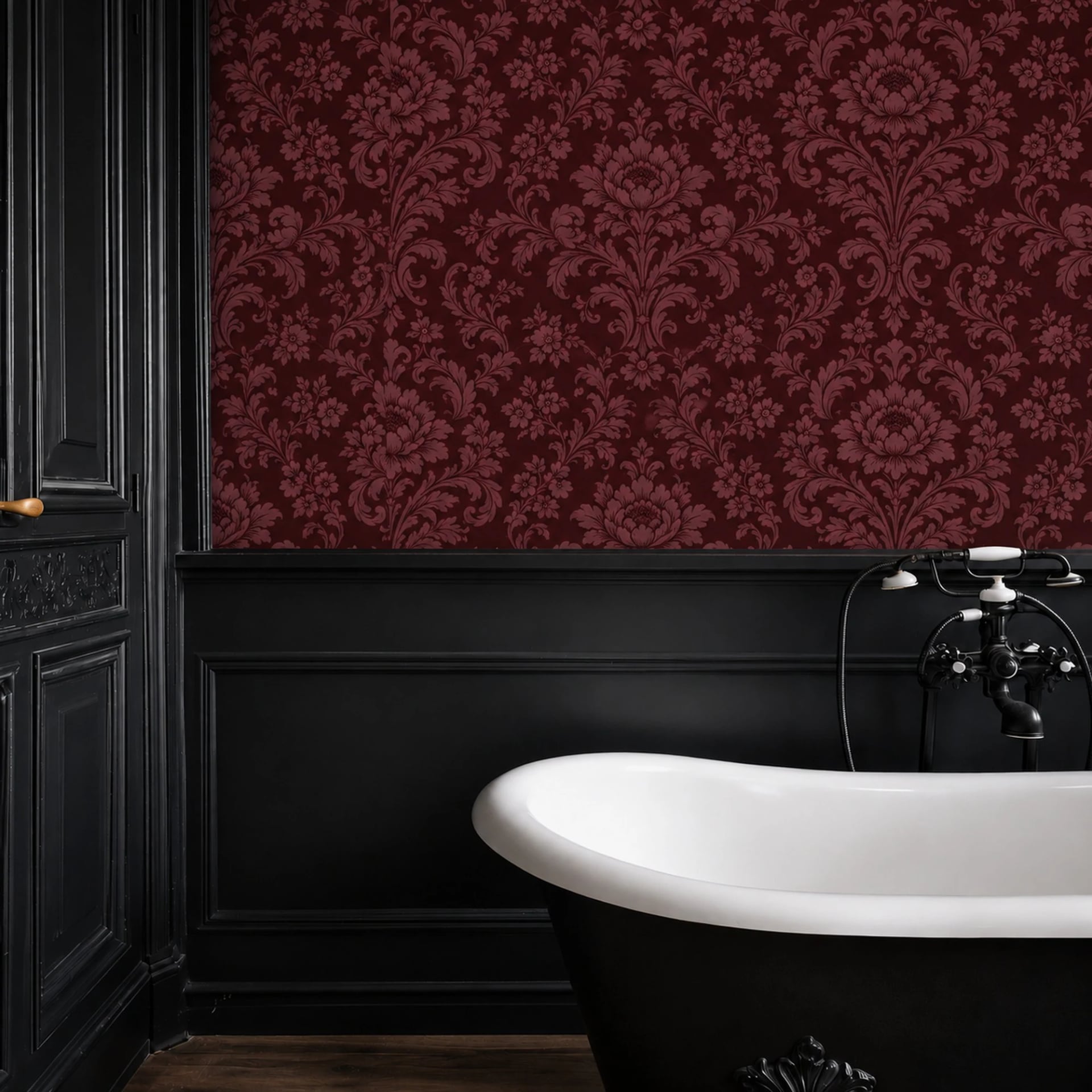
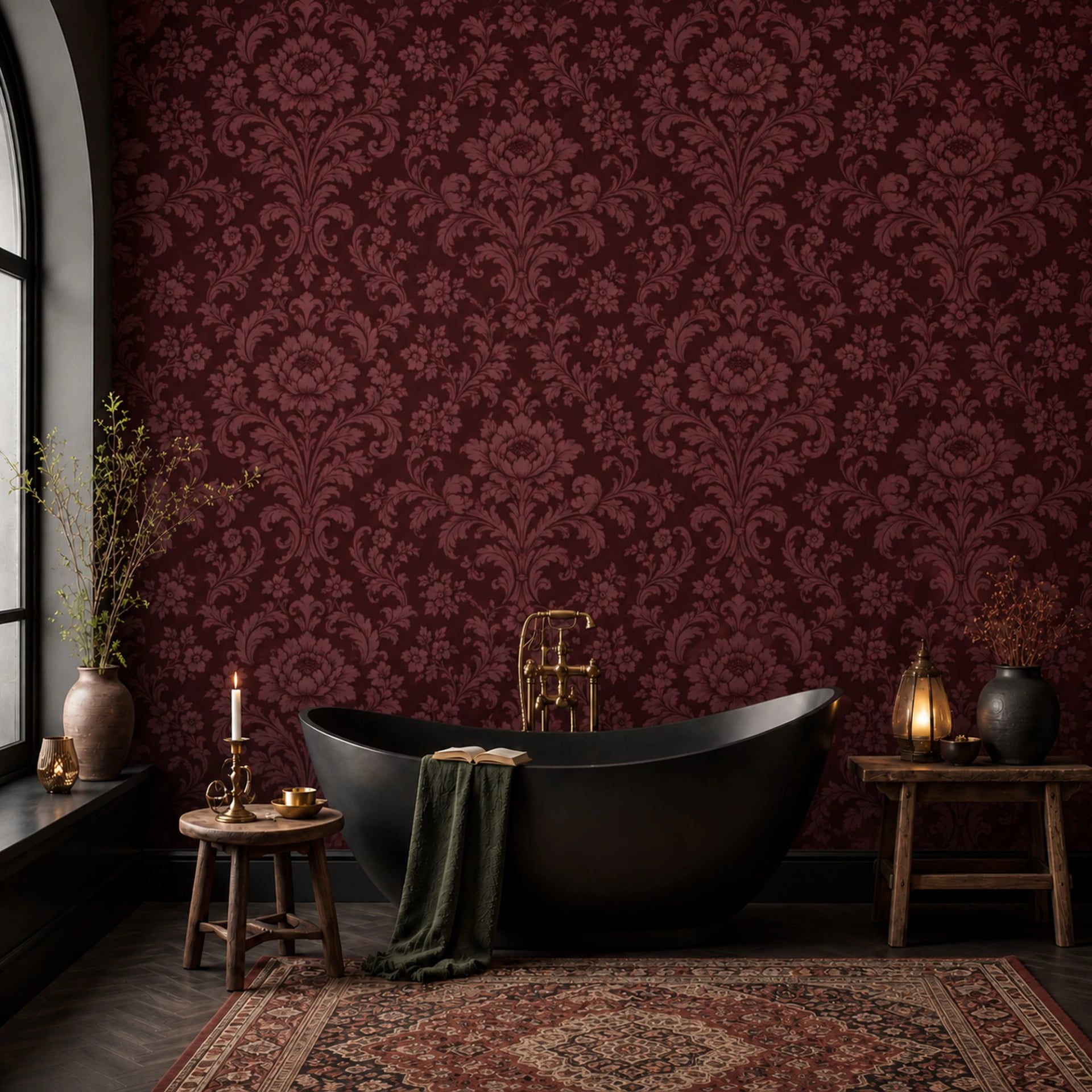
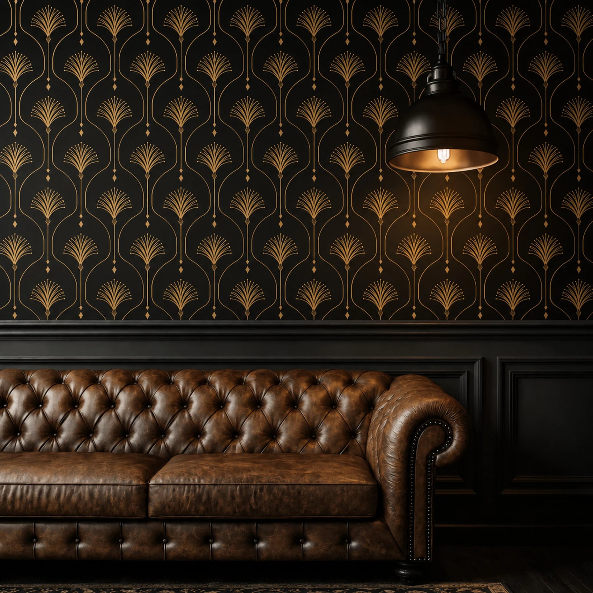
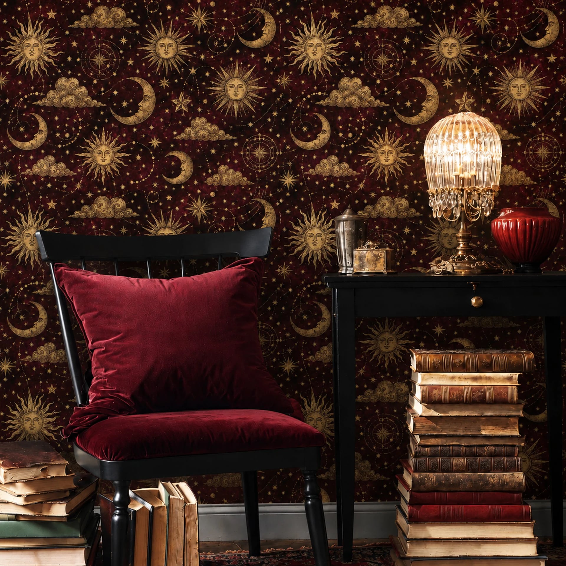
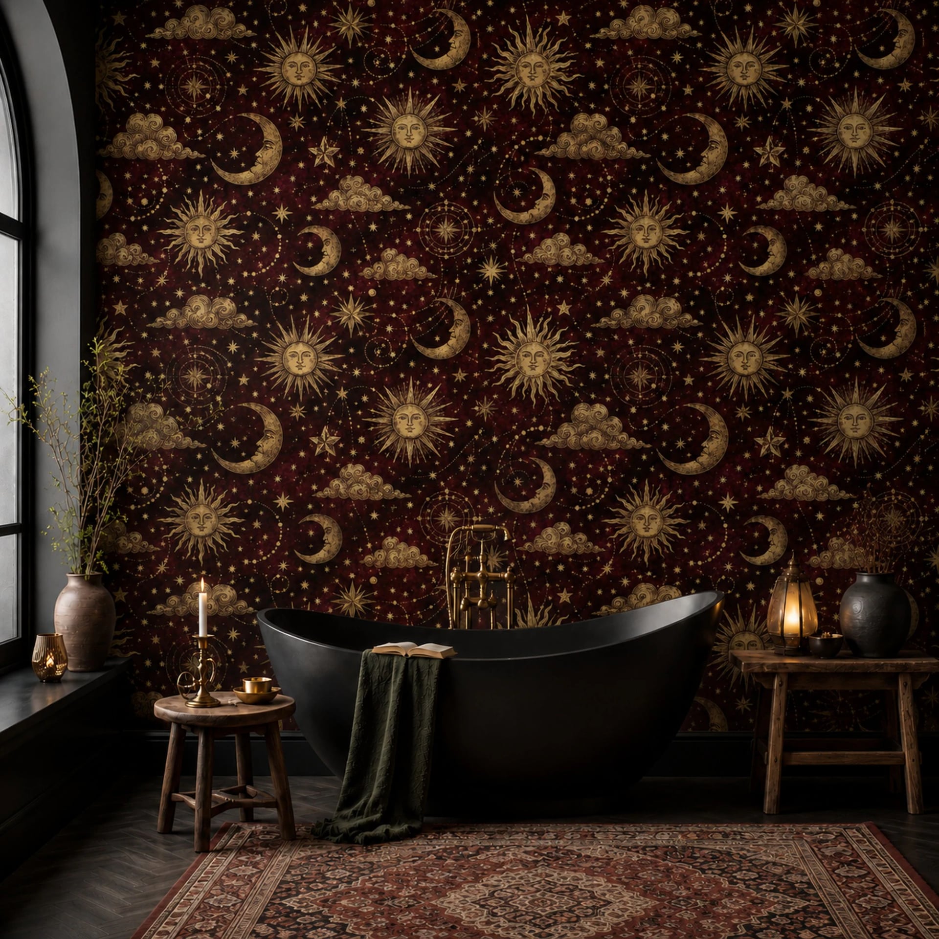
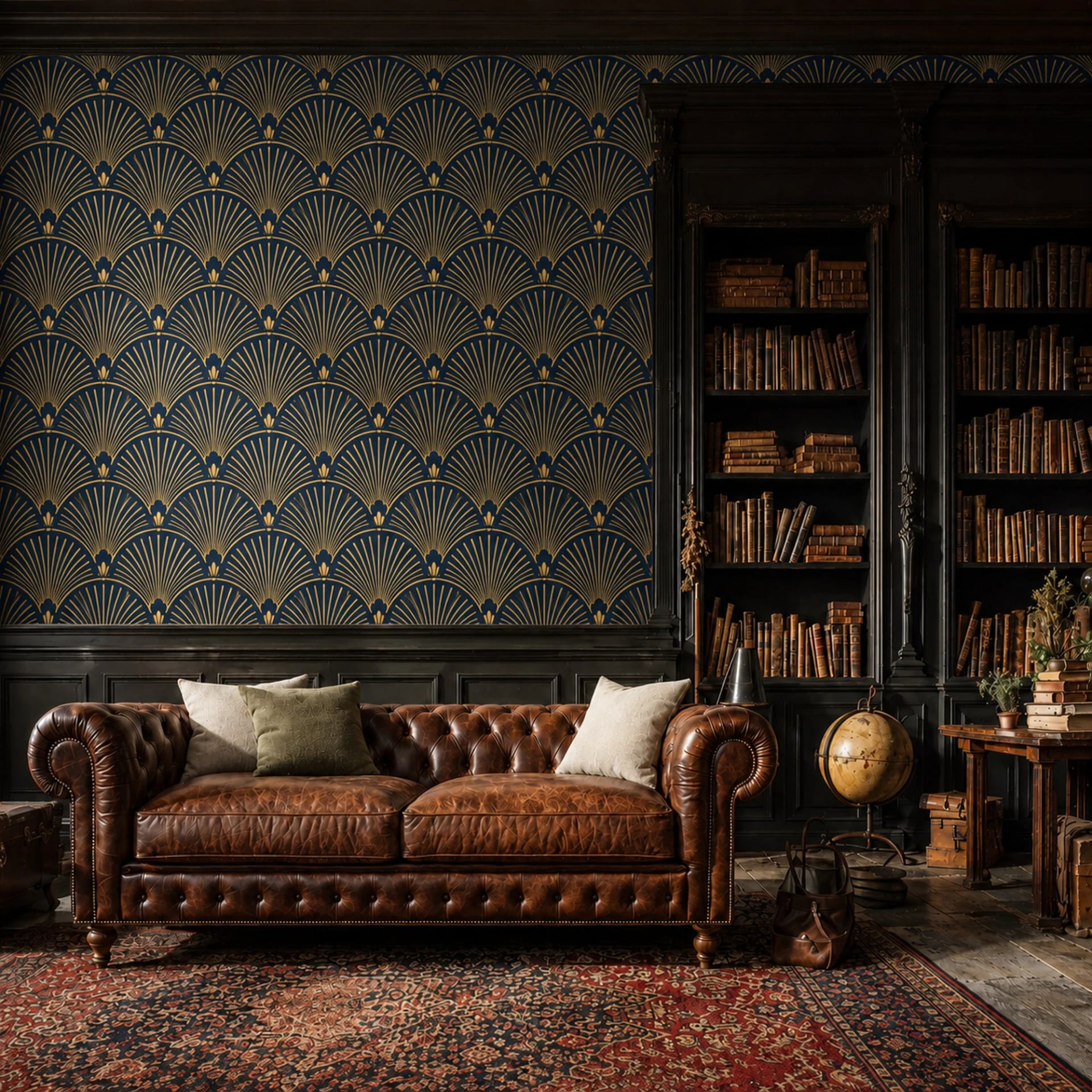
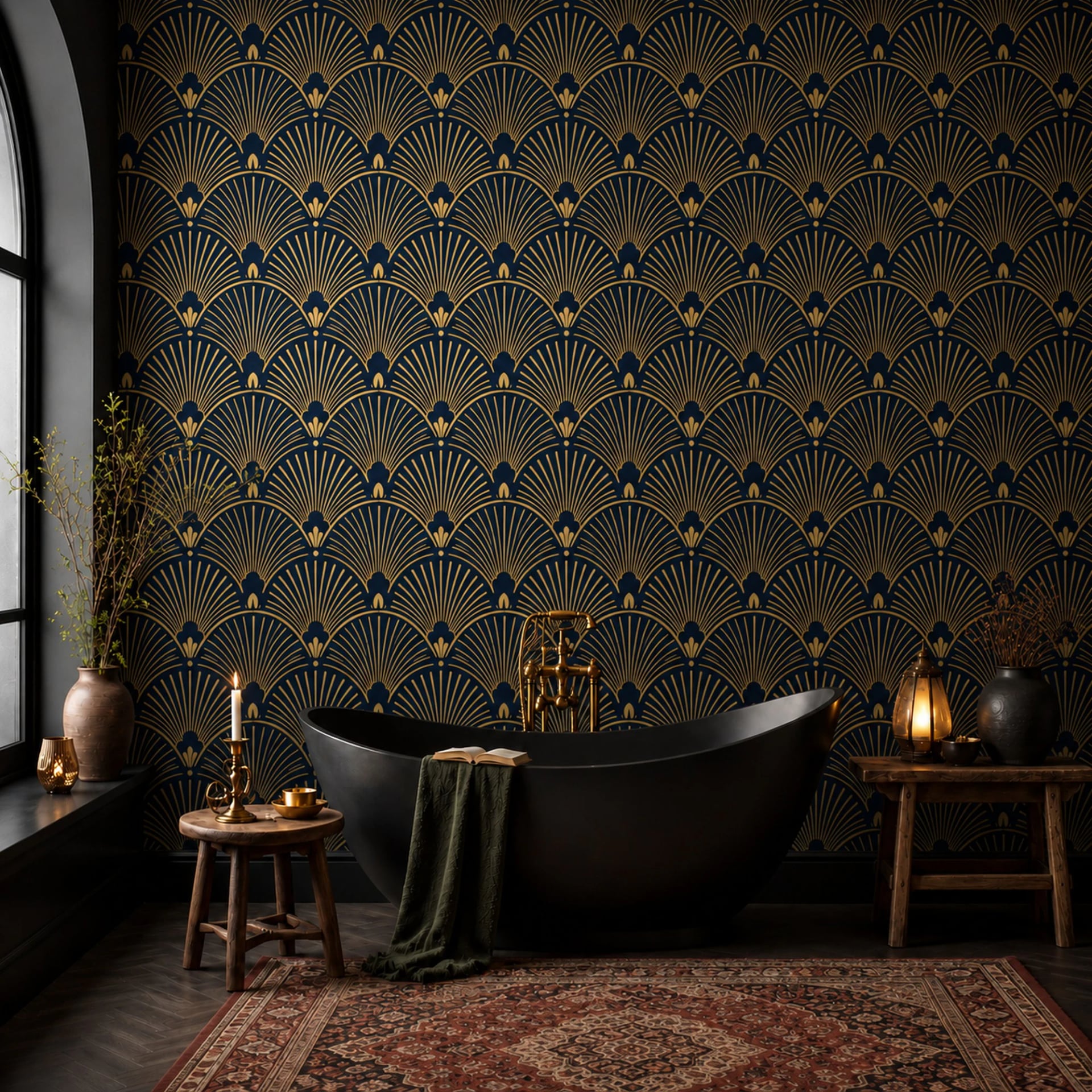
Very high contrast small pattern. It photographs beautifully and it is exhausting in a room. If you love the look, put it in a space you pass through rather than one you sit in.
How to actually commit
Whatever direction you like, do the same two things before ordering.
Order samples. They are cheaper still in fours, and a sample is a fraction of what it costs to be wrong about a wall. Tape them up and leave them for a few days, because a color you love at ten in the morning can be a different color at nine at night.
Then look at the wall and ask what else is going in front of it. Trends are chosen on empty walls and lived with on full ones. The design that survives is the one that still works with a sofa, a lamp and a stack of books in front of it.