Small entryway, big mural: seven ways to use scale
An entryway is usually the smallest room in the house and the first one anyone sees. Seven ways scale works in your favor there, and the two ways it works against you.
Room guides · The Wallbu team · Jun 18, 2026 · 6 min read
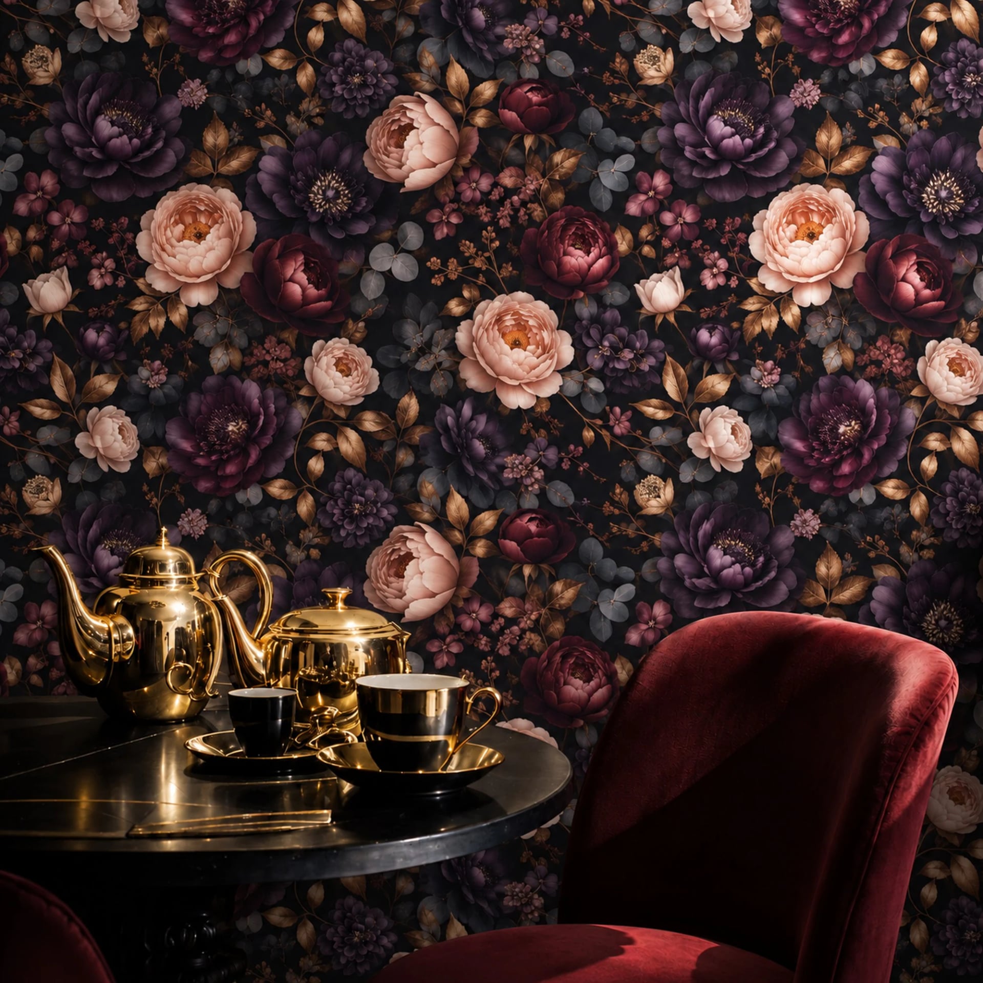
Entryways get treated as circulation. They are four feet wide, they hold a coat hook and a pile of shoes, and they are decorated last with whatever paint is left over.
They are also the only room every visitor sees, and the room you pass through eight times a day. They reward attention out of all proportion to their square footage, and the reason is scale: a small room is where a large design has the most effect per dollar, because there is so little wall to cover.
Seven ways to use that.
1. One wall, floor to ceiling, no border
The most common entryway mistake is treating a small wall gently. Half height, a pale color, a modest pattern. The room ends up looking like a corridor that was decorated by someone in a hurry.
Do the opposite. Take one wall, usually the long one you walk alongside, and run the design from baseboard to ceiling with no border and no margin. The uninterrupted vertical is what gives a low-ceilinged space height.
2. Make the pattern too big on purpose
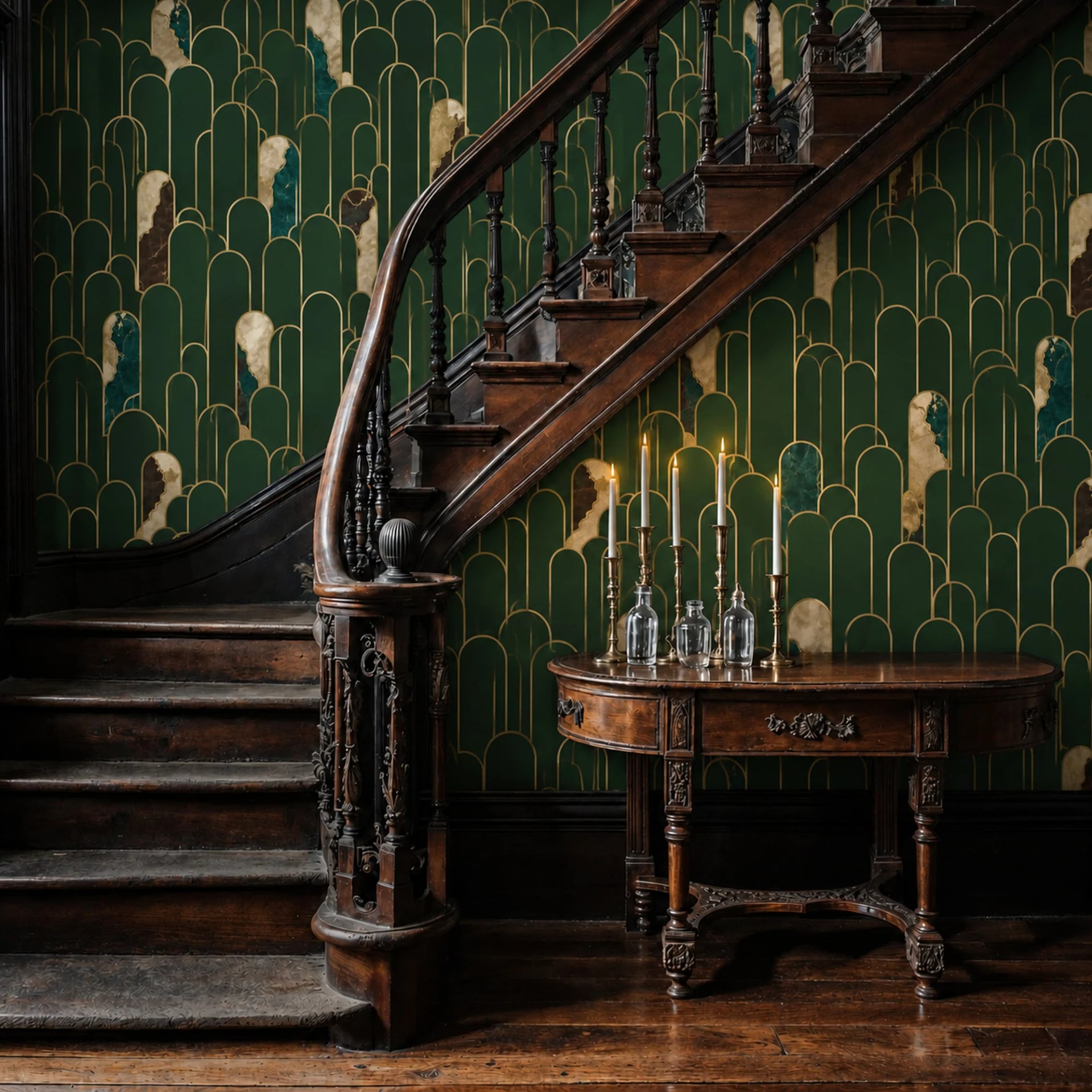
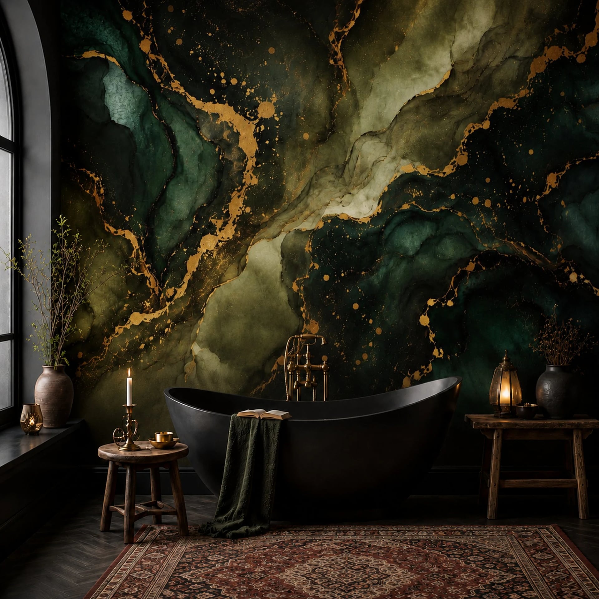
A leaf that would be twelve inches across in a living room can be thirty inches across in an entryway. At that scale, the eye stops reading it as a pattern and starts reading it as an image, and an image has depth. A small repeat in a small room just emphasizes how little wall there is.
Because murals are printed to your measurement, you set the scale. In the configurator, push the motif larger than feels sensible and look at the preview. It almost always looks right.
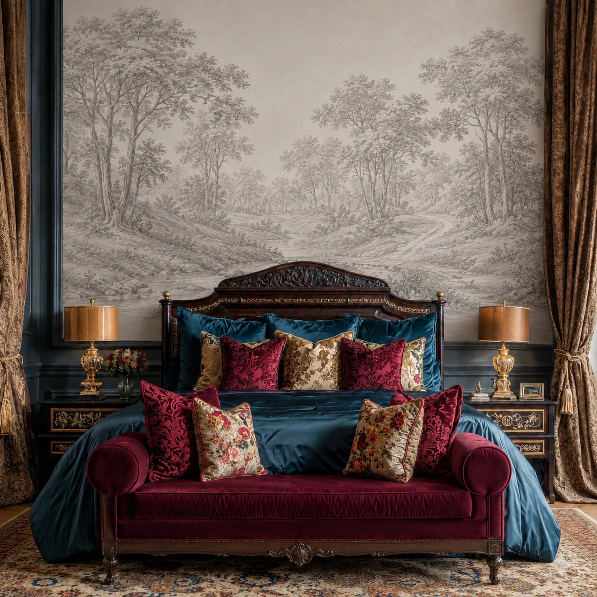
3. Use a scene with distance in it
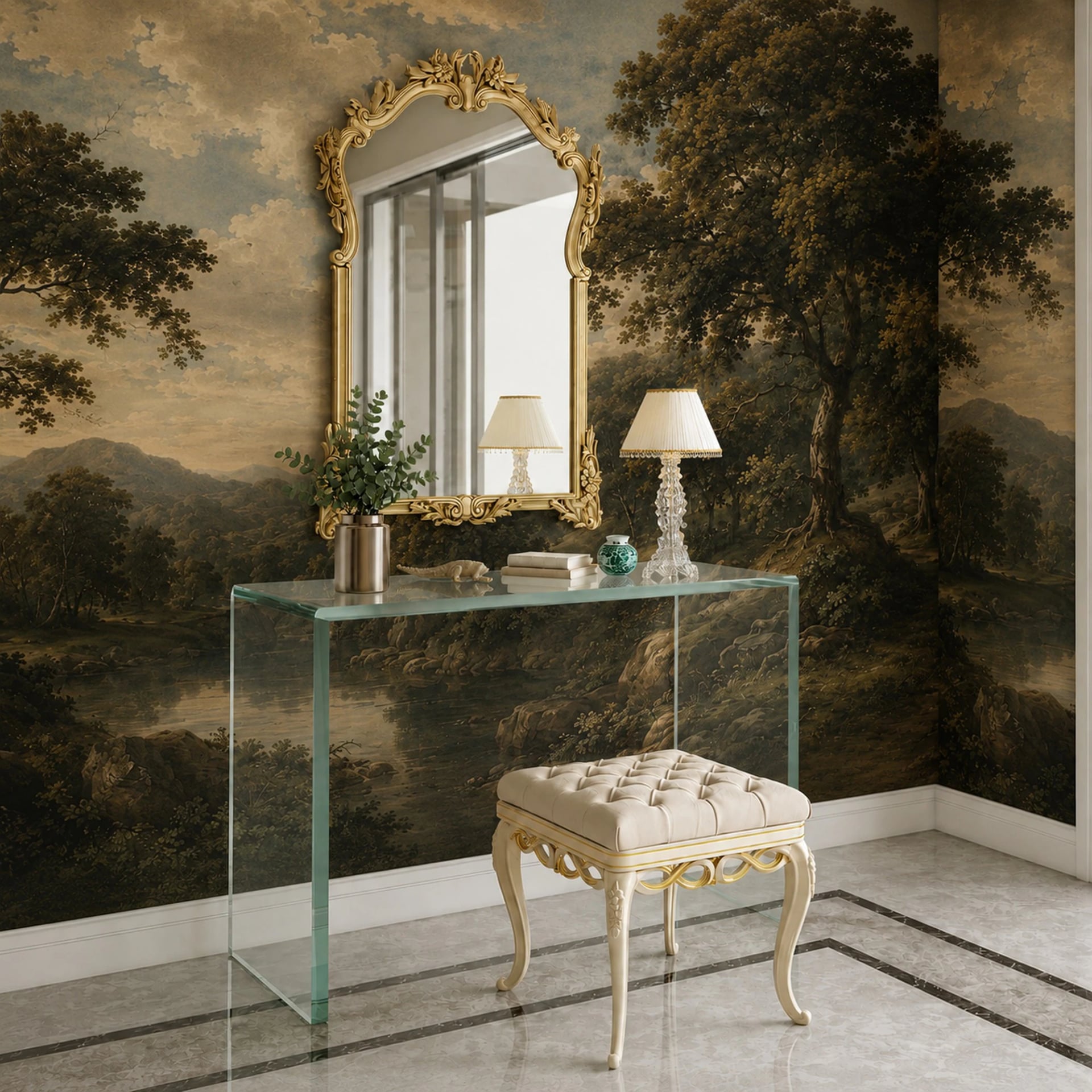
A view down a path, a treeline receding, a horizon, an arch with something behind it. Anything with a background does the same trick a window does. Put it on the wall at the far end of a narrow hall and the hall reads longer.
This works best on the end wall, not the long wall. On the long wall, distance is wasted because you are never far enough back to see it.
4. Take it up onto the ceiling
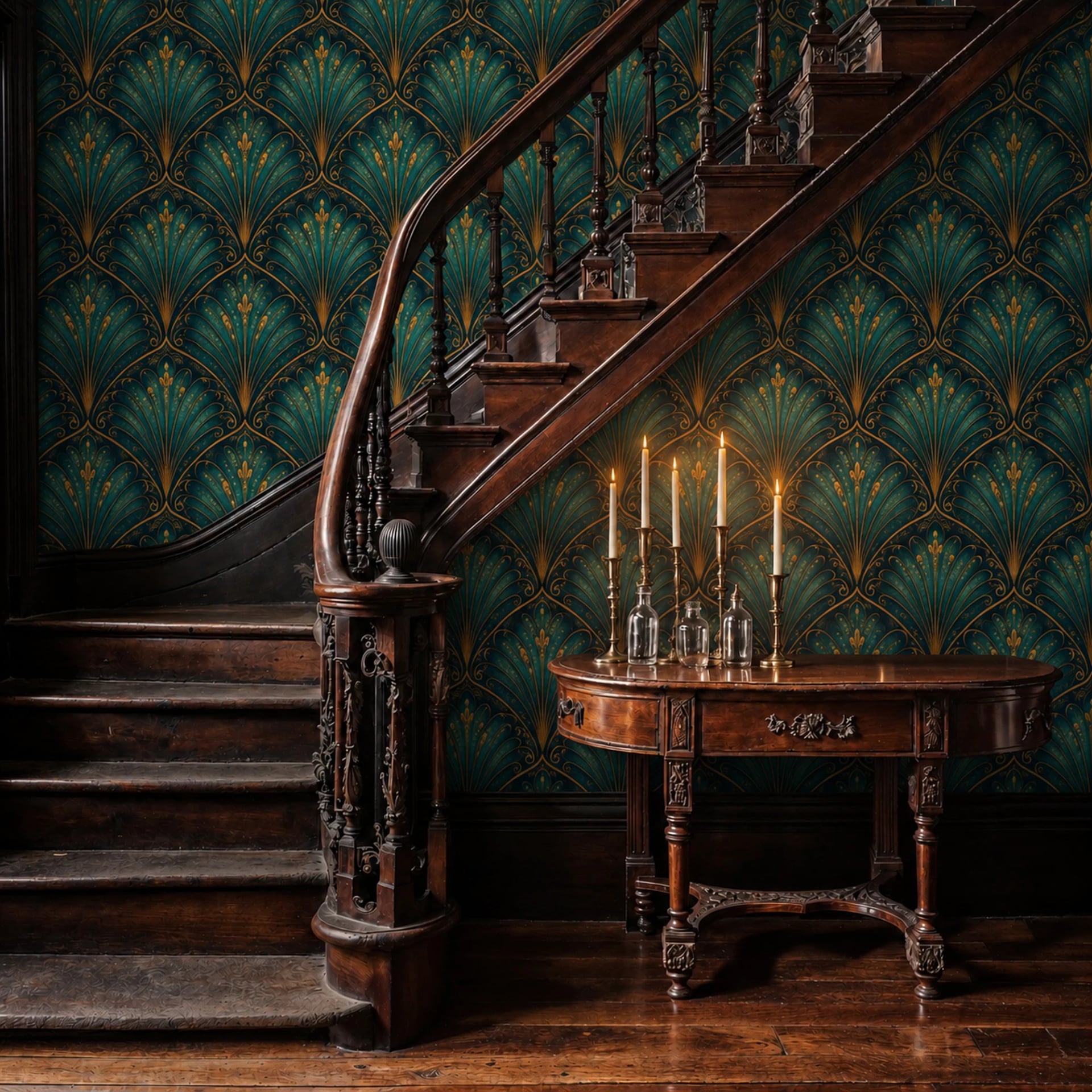
Entryway ceilings are small, often under forty square feet, which makes them one of the very few ceilings that are affordable and physically manageable to paper. Running a design from the top of one wall onto the ceiling erases the line where they meet, and a room without a visible ceiling edge feels taller.
Order the wall and the ceiling as two murals and tell us they meet, so we can set the crops to continue.
5. Line the inside of a coat nook
If you have an alcove, a nook or a run of open shelving, paper the inside of it rather than the wall around it. A small, bright, patterned recess behind coats and bags reads as deliberate, costs almost nothing in square footage, and survives the fact that the rest of the room is full of stuff.
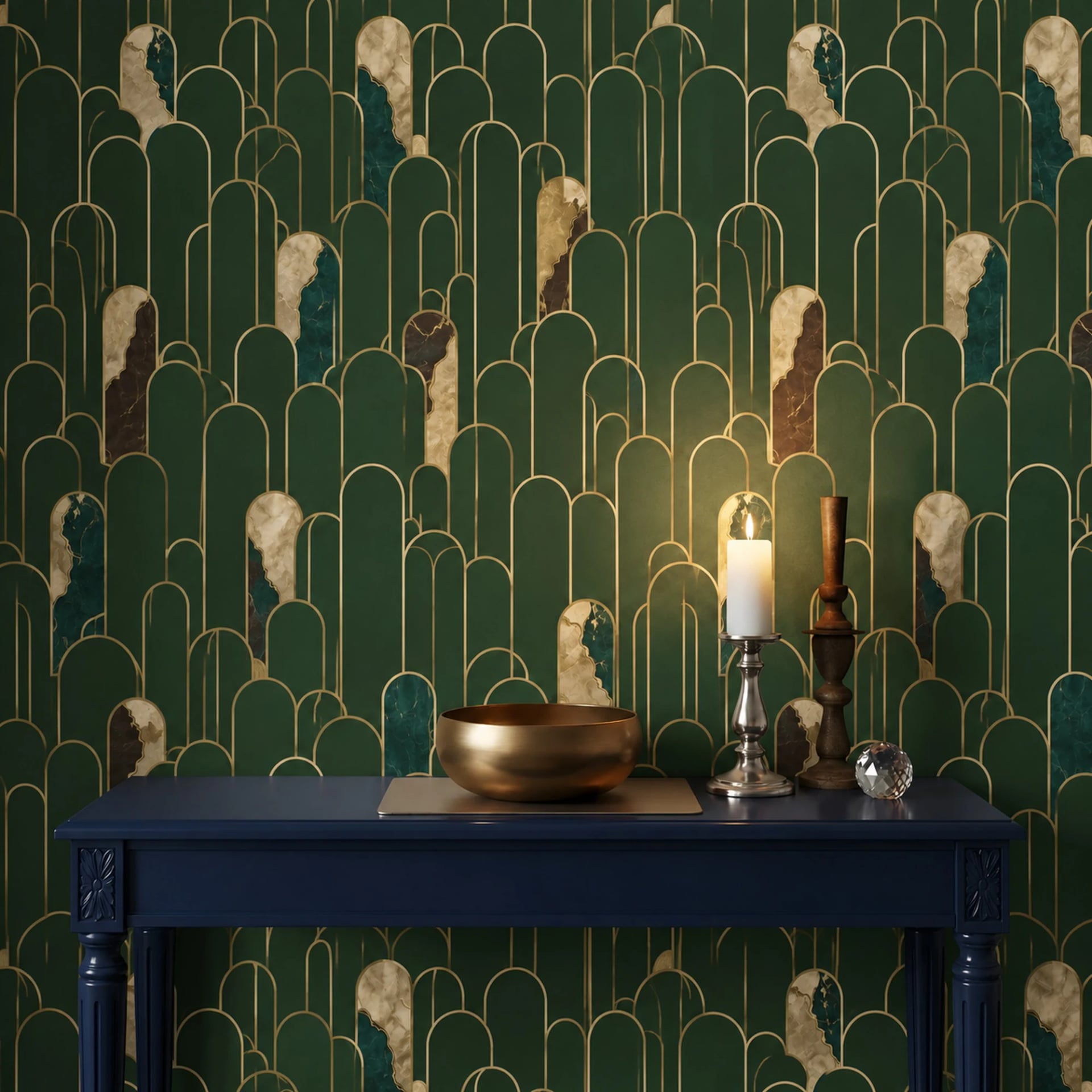
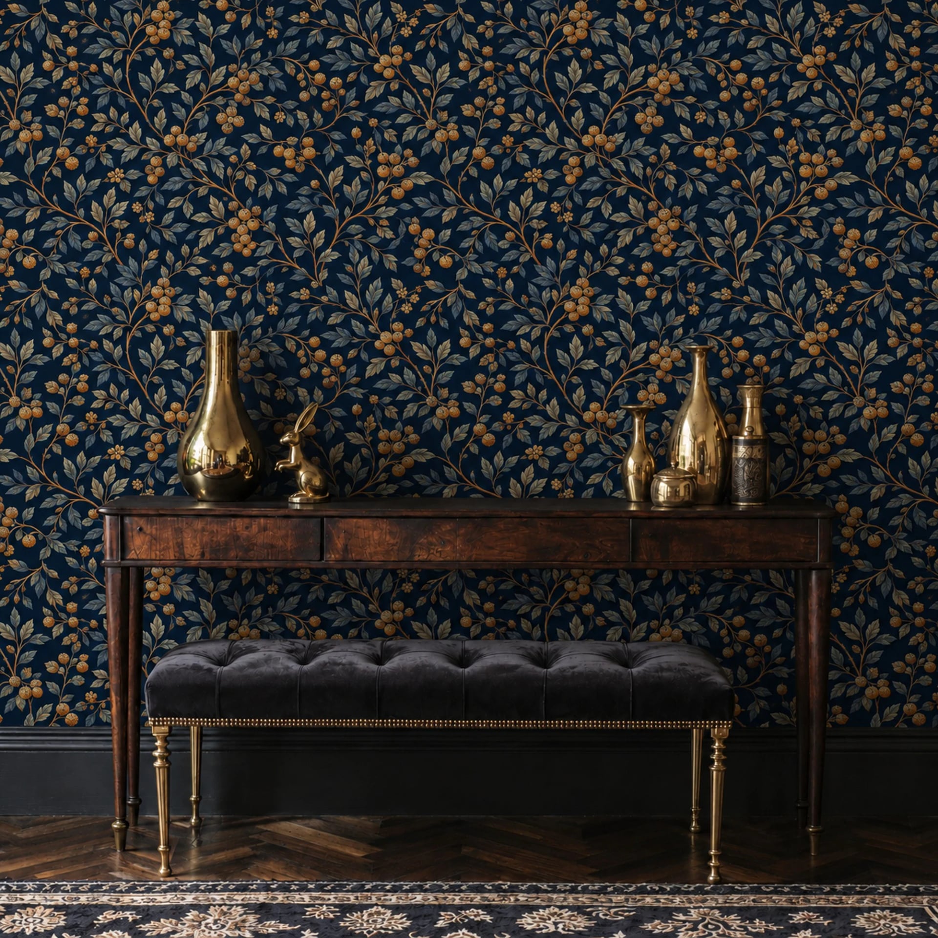
6. Go dark
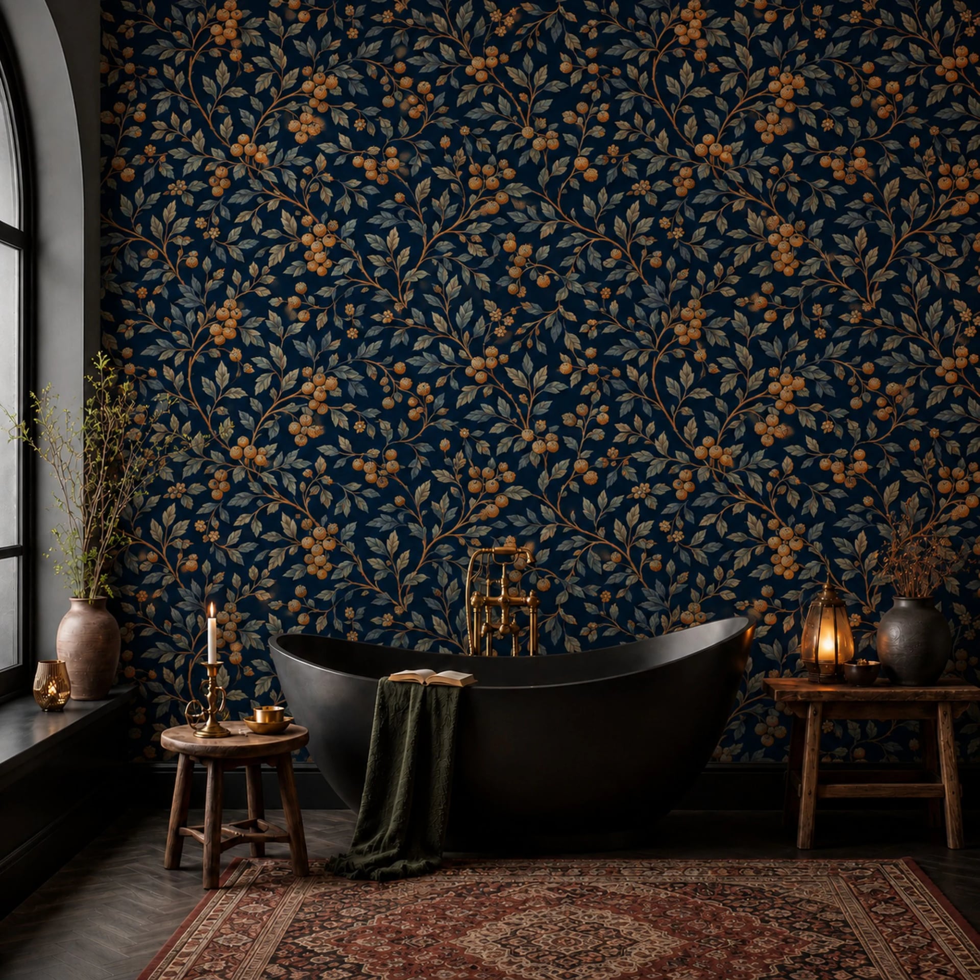
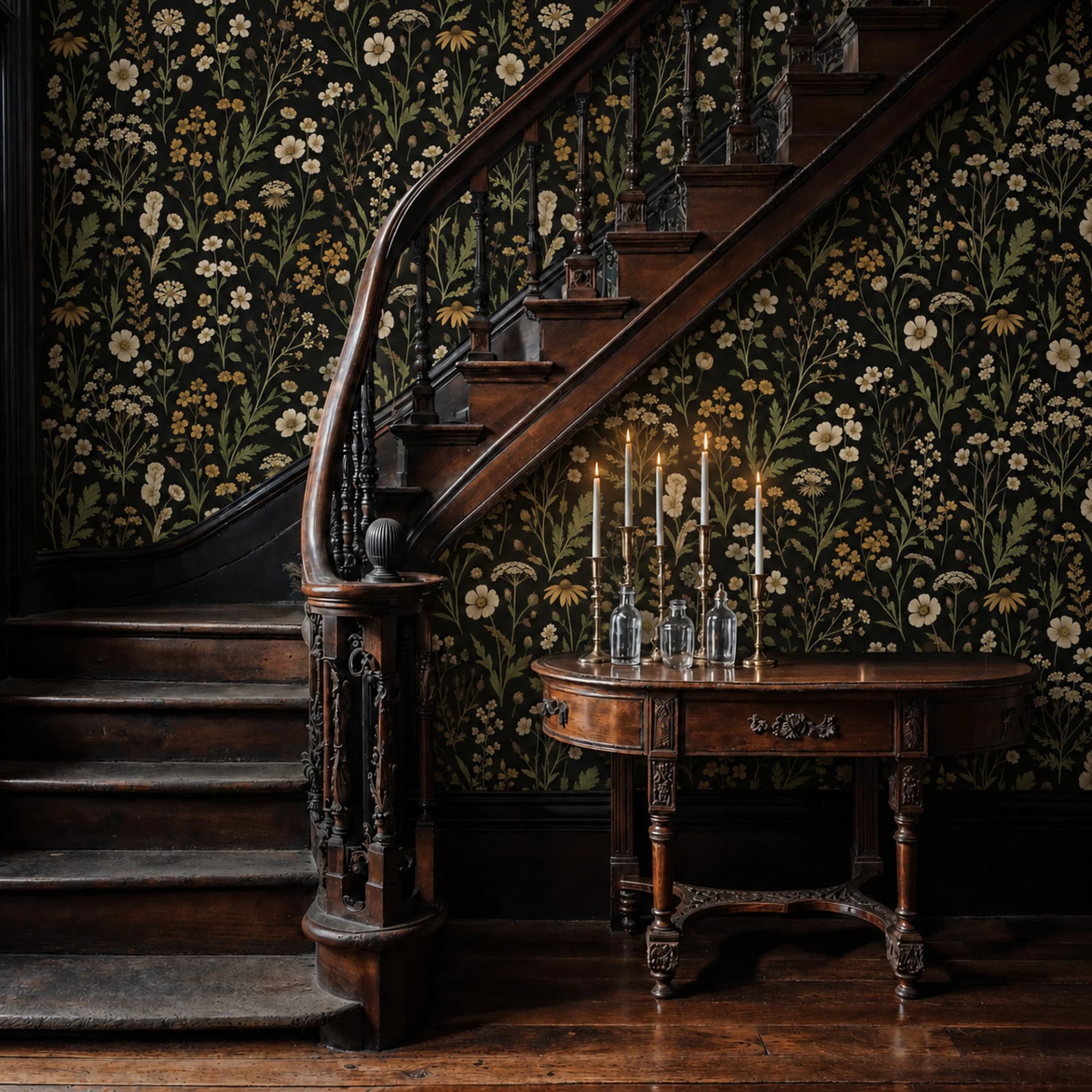
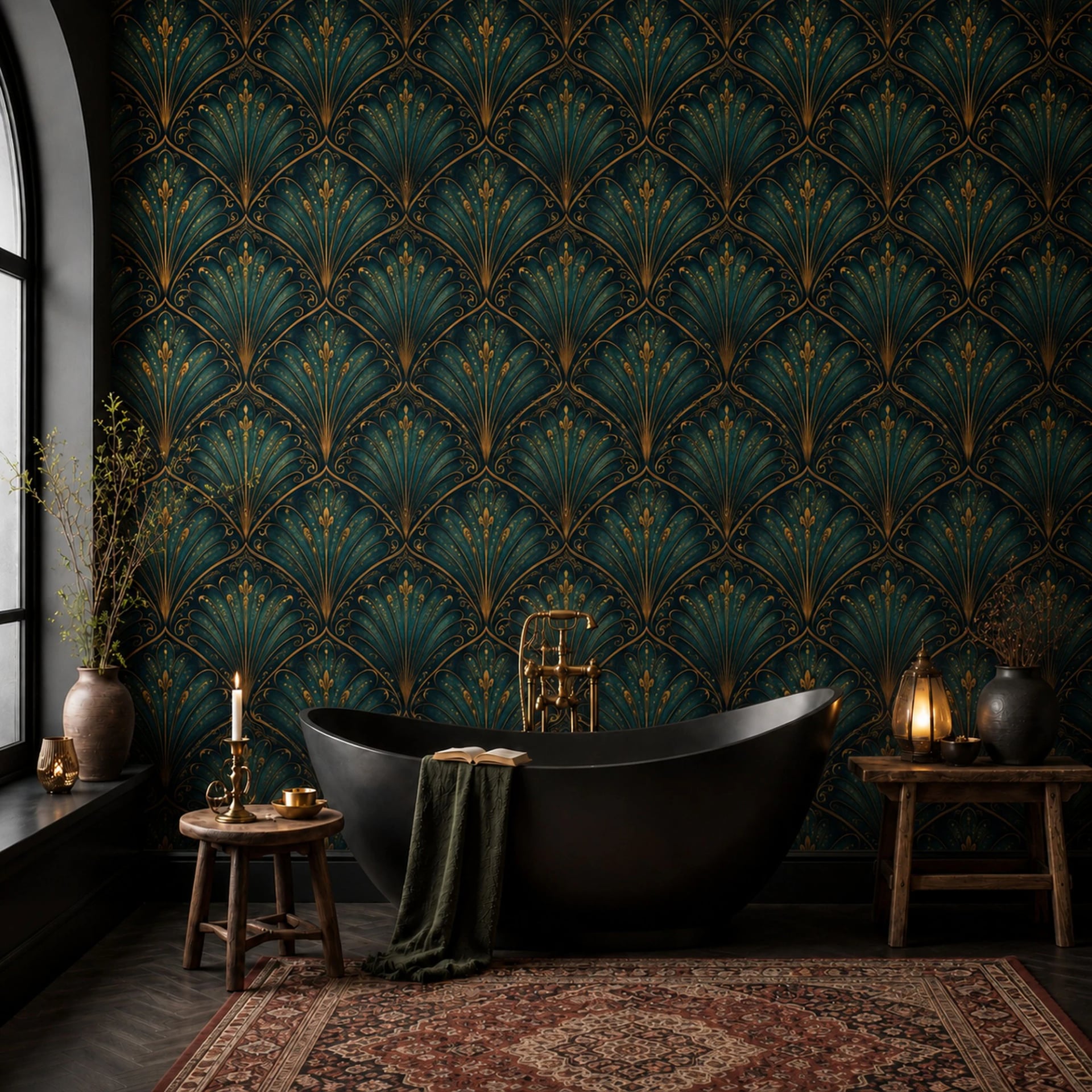
Small rooms are told to be pale. Entryways are the exception, because you do not linger in them. A dark, saturated wall in an entry makes the room you walk into next feel bright and open by contrast. It is a two-second experience and it works on everyone.
Dark also hides the thing entryways actually suffer from, which is scuffs.
7. Line up the design with what is in front of it
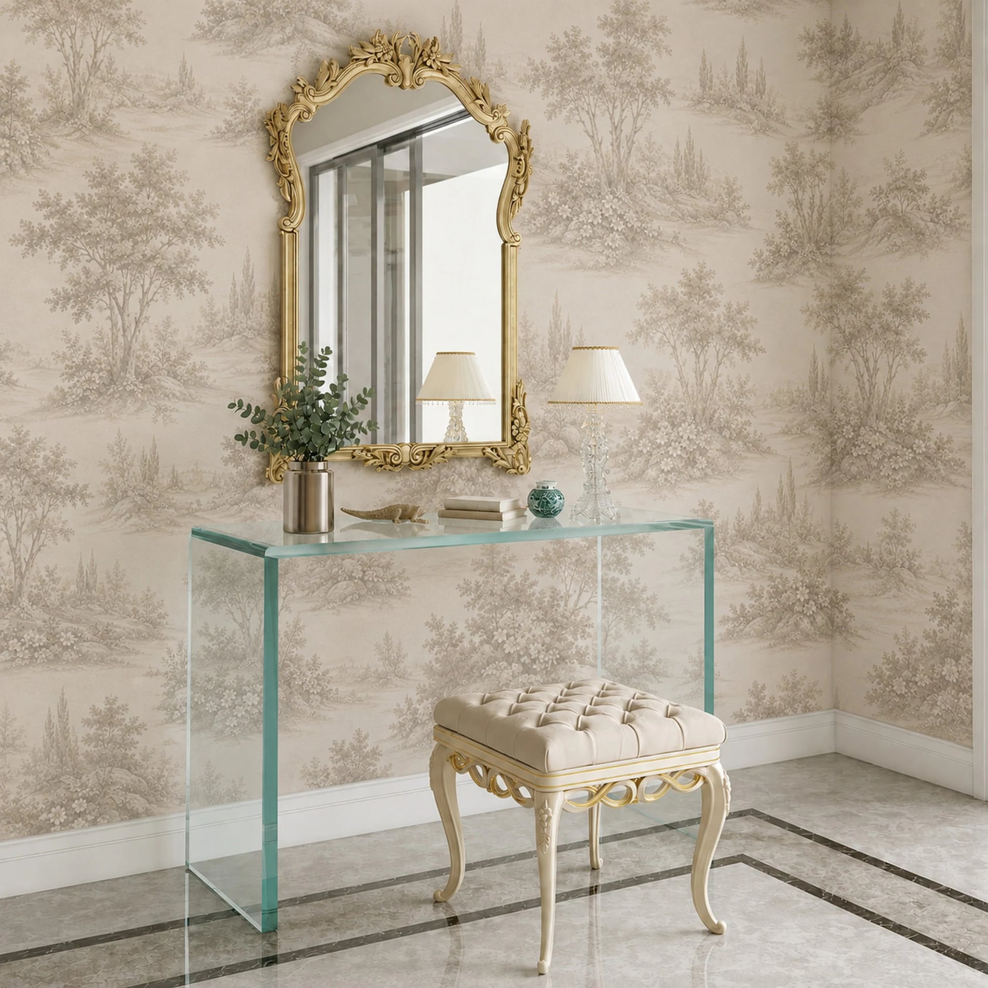
Before you order, note where the console table, the mirror and the coat hooks will sit. Then set the crop so the focal point of the artwork is not behind the mirror or hidden by a coat rack at eye height.
This is a thirty-second decision at ordering time that people regret skipping for years.
Two ways scale works against you
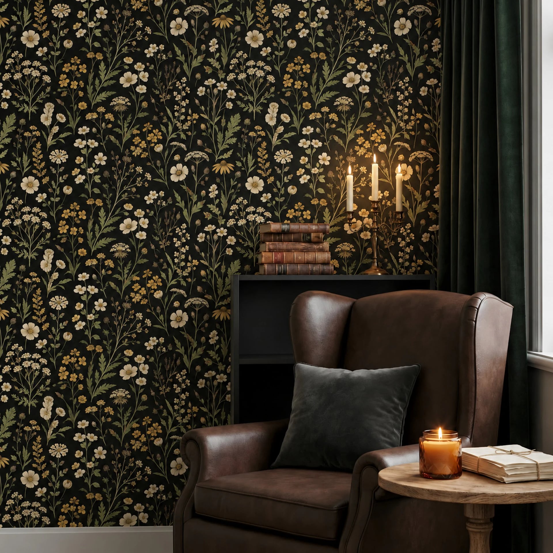
A busy pattern in a room full of objects. Entryways hold coats, bags, shoes, keys and a parcel someone left by the door. A design with a lot of small detail competes with all of it and loses. Large shapes and quiet color survive the clutter; fine detail does not.
A pattern that dies in the corner. In a four-foot-wide space you are often looking at two walls at once, and a design that is clearly cut off at the corner draws attention to how narrow the room is. Either give one wall the mural and leave the others plain, or order both walls together and tell us to continue the scene around the corner.
The practical part
Entryways get touched. Door handles, wet sleeves, a bicycle, a dog. Pick the material accordingly:
- Textured if the entry takes real traffic or opens straight to the outside. It is the heaviest of the wipeable four and the only one we would put behind a coat hook.
- Premium Textile if the wall has a heavy grain, which older hallways usually do.
- Peel and stick if you rent, which in an entryway is the most common case of all.
The square footage is small enough that stepping up a material tier costs very little here. A four-by-eight-foot wall is thirty-two square feet. That is the one room where the upgrade is easy to justify.